Build by The Wall
Variables
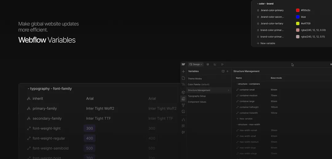
BRICKS organizes variables into five main categories to make global website updates more efficient, predictable, and scalable, while maintaining a lightweight, semantic system. During the initial setup, you can quickly adjust the overall look and feel of your site by modifying variable values, leaving only secondary styling to be applied manually through classes or styles.
Theme Modes
This category manages everything related to global theme and mode control. By default, it includes the
color-button and color-theme groups. Start by defining your light and dark modes along with their corresponding accent colors. You can also add additional themes beyond light and dark by creating new color variables and assigning appropriate values. Themes are applied to the .page-wrapper class, which sets the base mode for each page. They're also integrated into the Section component (under Build Mode) to simplify theme usage for collaborators building landing pages or modular layouts.Variables and coresponding CSS
- Variable CSS values can be copied and used for custom theme mode setup via Global Website Embed
When adding new color modes, be sure to create the necessary custom code inside the
global-styles_theme-color embed, which you can find in the Webflow Components section.Color Palette
BRICKS features a highly flexible and scalable color variable system. It helps designers and developers create visually rich, accessible, and brand-consistent experiences. Define your brand colors and take advantage of a 9-step tint system to give your components depth, flexibility, and polish.
Examples of variables and their coressponding CSS names
brand-color-primary
var(--color-brand--brand-color-primary)
black-tint-xlight
var(--color-black-tints--black-tint-xlight)
Structure Management
This category contains layout-related variables for containers, max widths, paddings, and spacing. BRICKS uses a unified spacing system, rather than separate values for margin and padding—allowing you to control margins, paddings, and gaps using a single variable set. Updating these values gives you instant, project-wide layout consistency.
Examples of variables and their coressponding CSS
padding-vertical-large
var(--_structure-management---structure-padding-padding-vertical--padding-vertical-large)
max-width-xsmall
var(--_structure-management---structure-max-width--max-width-xsmall)
Typography Setup
Manage all typography-related variables in one place: font families, weights, sizes, line heights, letter spacing, text transformations, and more. Responsive scaling and style variations are also handled here to keep your typography system clean and flexible. Sizing uses REM-based variables, aligning with the common 4px spacing rule for consistency across your design.
Examples of variables and their coressponding CSS
secondary-family
var(--_typography-setup---typography-font-family--secondary-family)
font-size
var(--_typography-setup---typography-headings-global-h2--font-size)
Component Values
This collection holds variables for core components such as border radius and foundational design elements. You can expand this collection with additional component-specific variables to further fine-tune your build, all while maintaining global control and structure.
Examples of variables and their coressponding CSS
radius-is-xlarge
var(--_component-values---components-borders-border-radius--radius-is-large)
width-is-regular
var(--_component-values---components-borders-border-width--width-is-regular)